PowerUp PowerUp
PowerUp PowerUp
PowerUp PowerUp

REECE GROUP
PowerUp
Client
Reece Group
What
- Brand strategy
- Brand identity extension
- Brand guidelines
- Illustrations + iconography
- Copywriting
- UI design
When Reece Group soft-launched PowerUp, an online learning platform to help tradies up-skill, the brand and product was still in the development stage. They enlisted our help to strengthen their brand proposition and create a comprehensive visual identity system that could be applied across a wide range of digital and physical environments.
01.
Approach
We consulted with a range of stakeholders from across the business to understand the functionality of the platform and the benefit it delivered to its users. We also unpacked what the brand stood for, and believed in, through a series of client workshops. PowerUp was determined to transform skilled tradespeople into skilled business people - sparking their desire to learn and unleash their previously untapped capability.
02.
The brand idea

03.
Brand extension
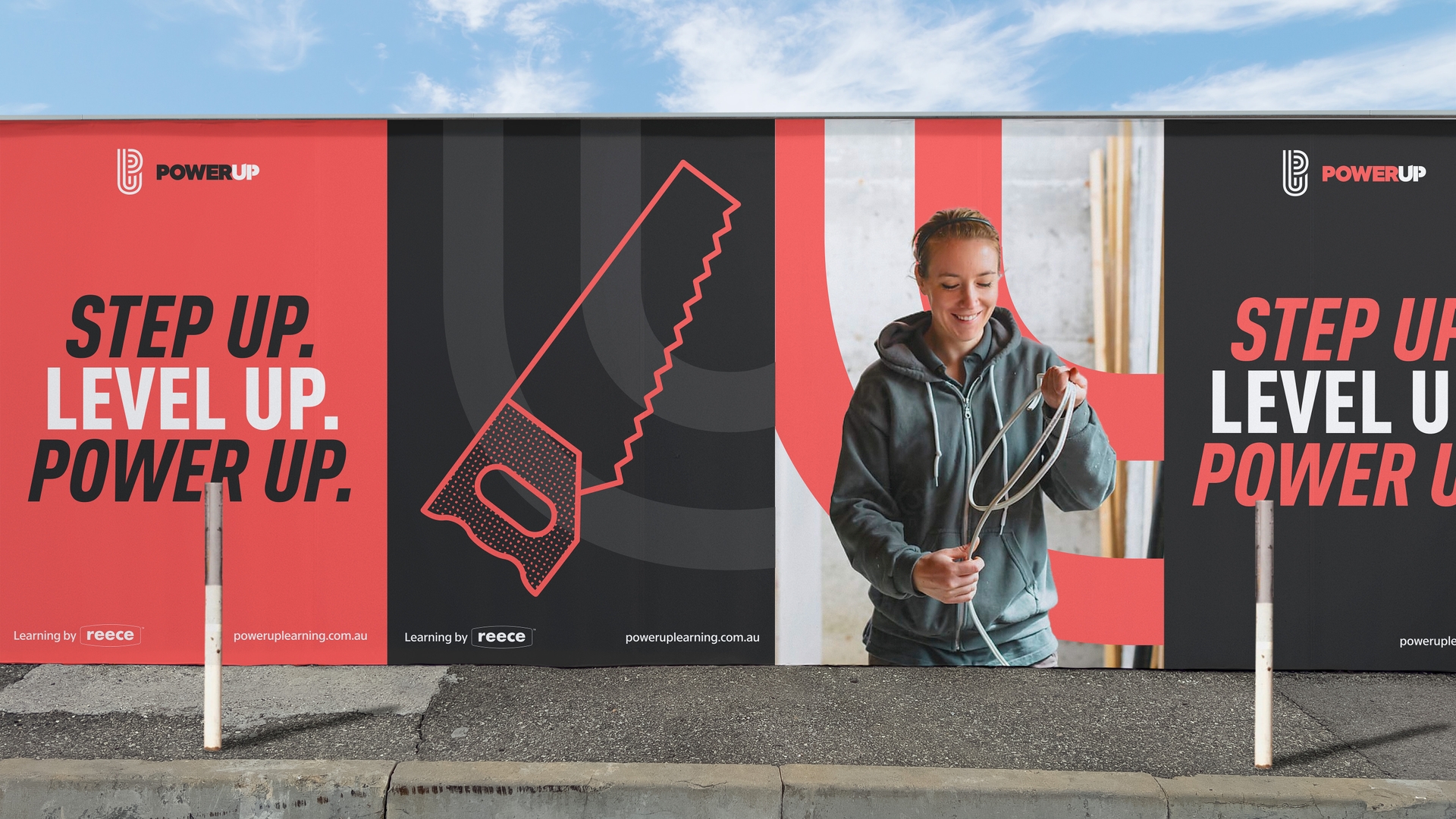
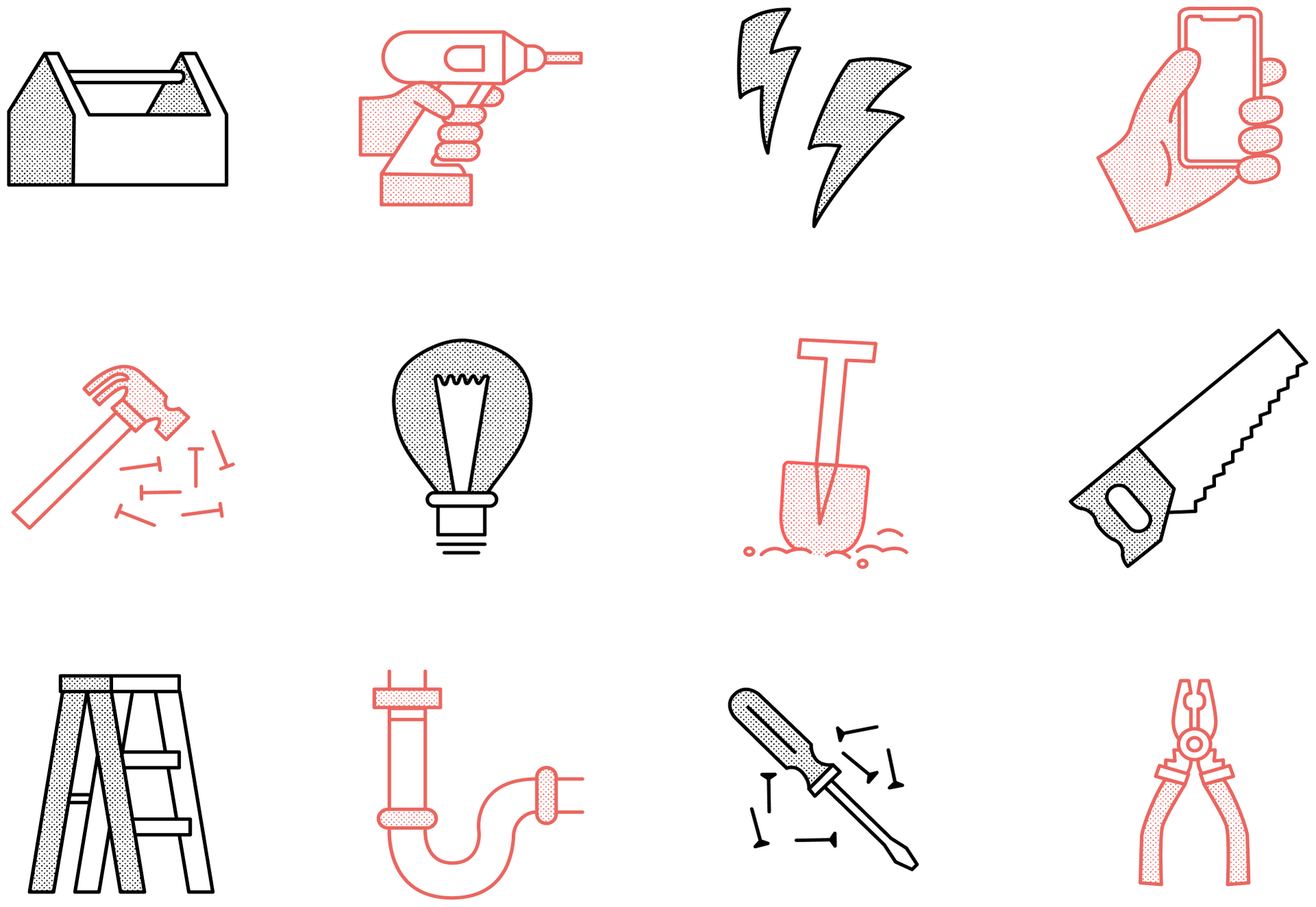
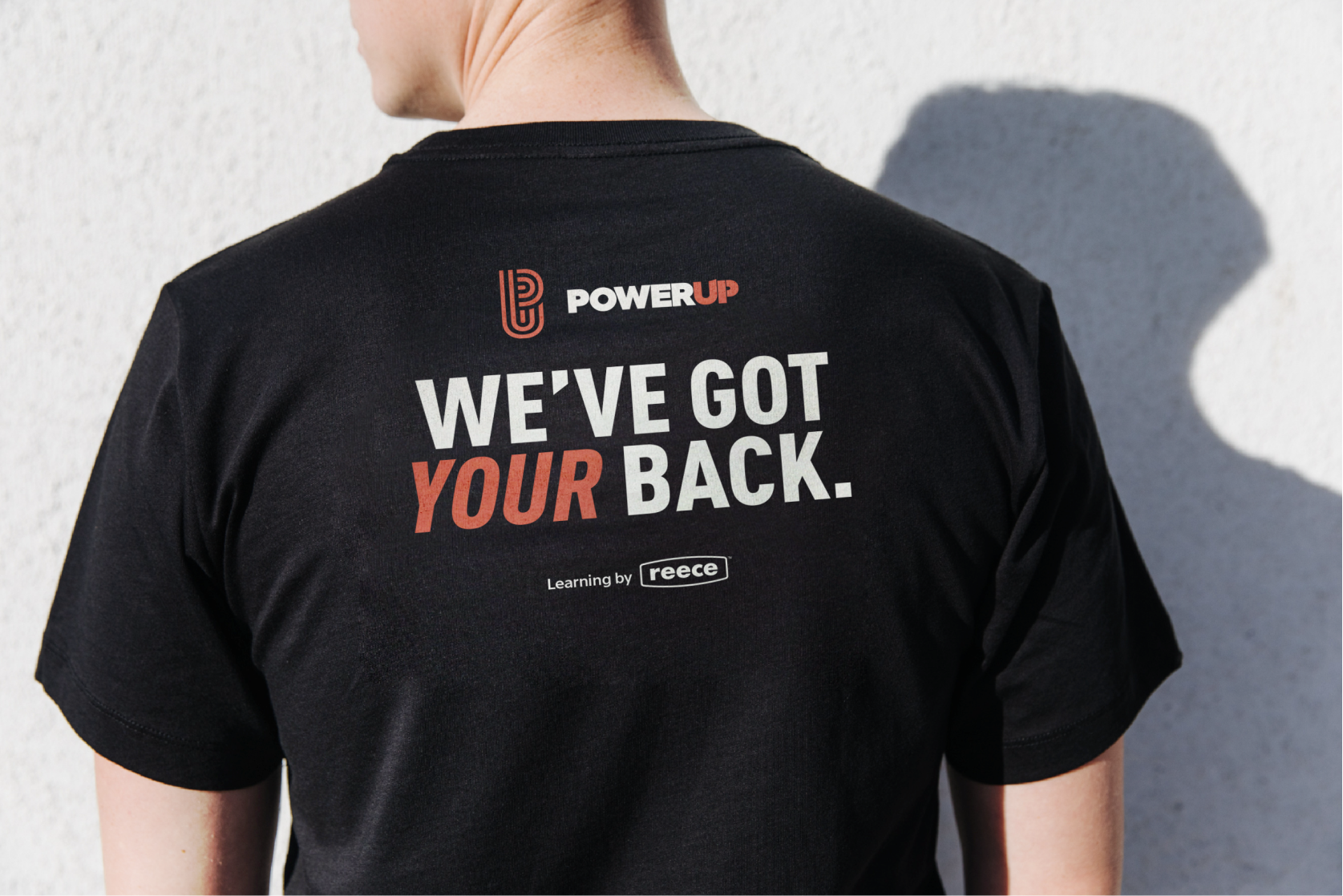
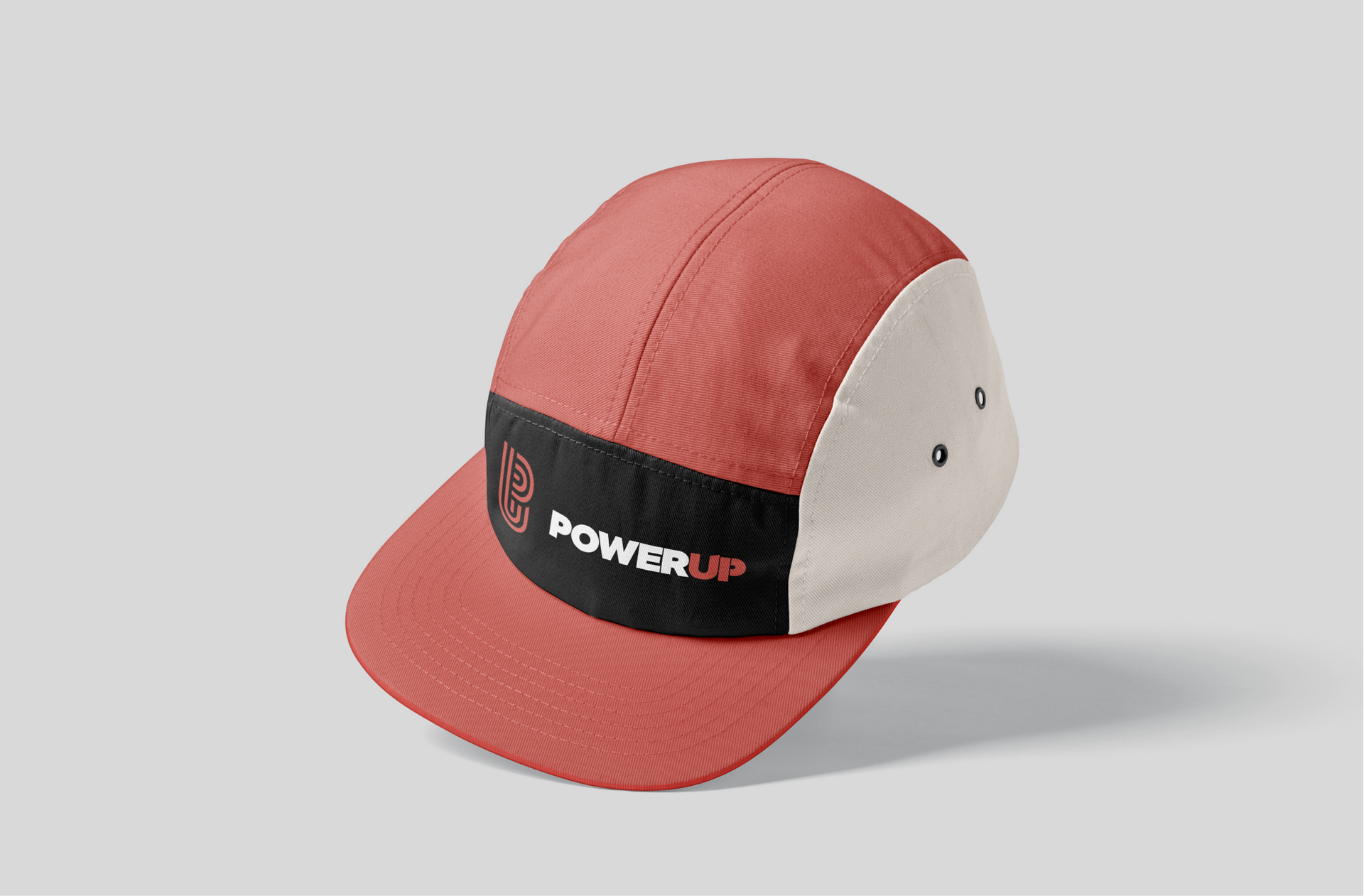
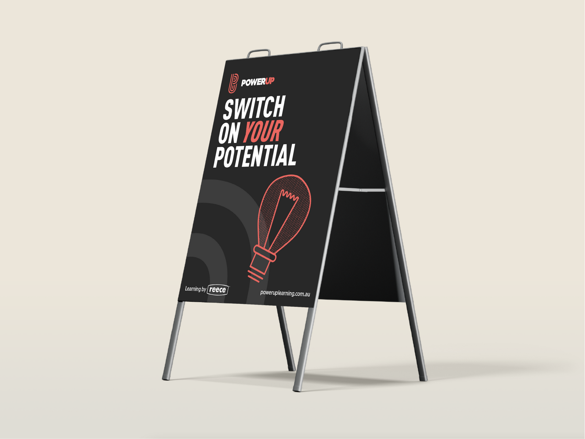
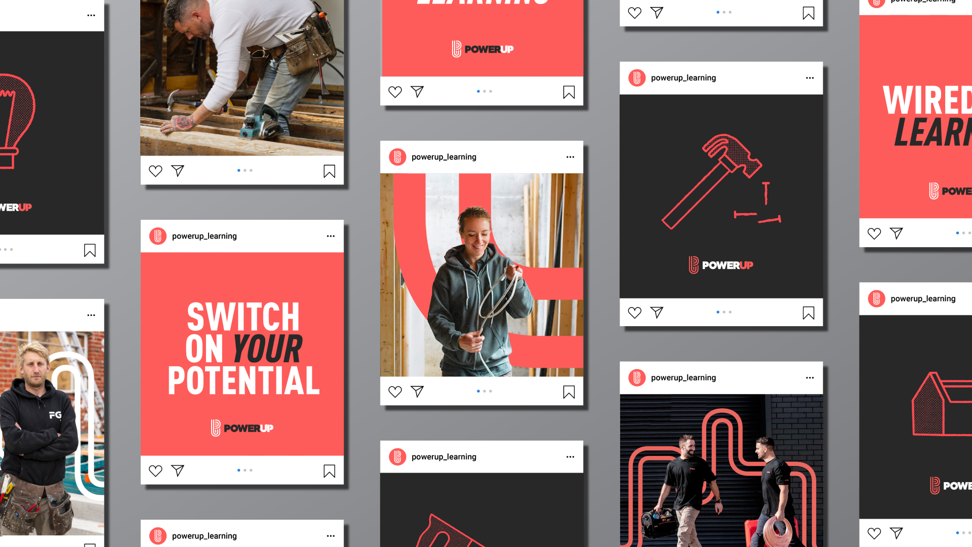
Taking the existing brandmark as our jumping-off point, we extended the visual identity to incorporate an updated colour palette and typography system, alongside a new visual language that included iconography, graphic elements, copy, photography and illustration.





Brand strategy - Brand identity
Copywriting - UI design
04.
Product Design
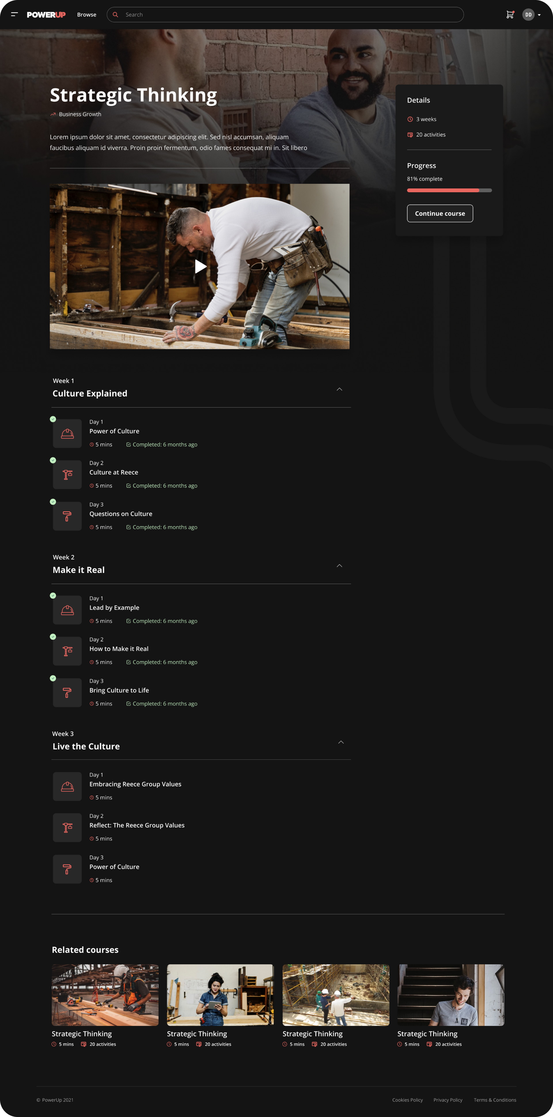
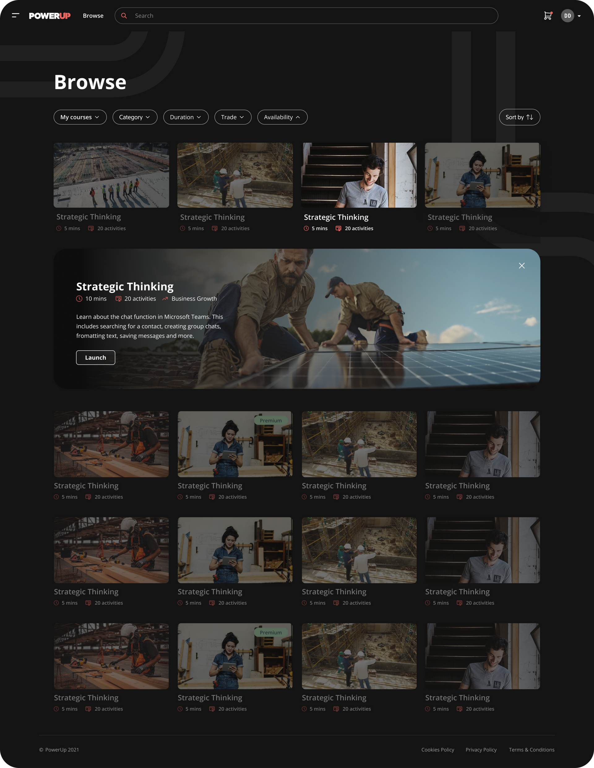
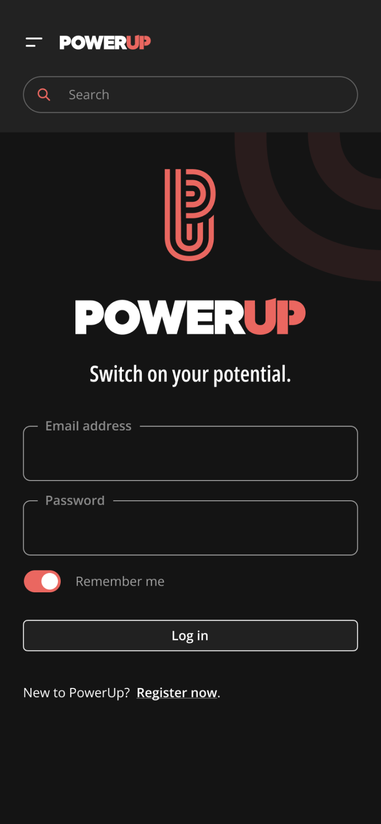
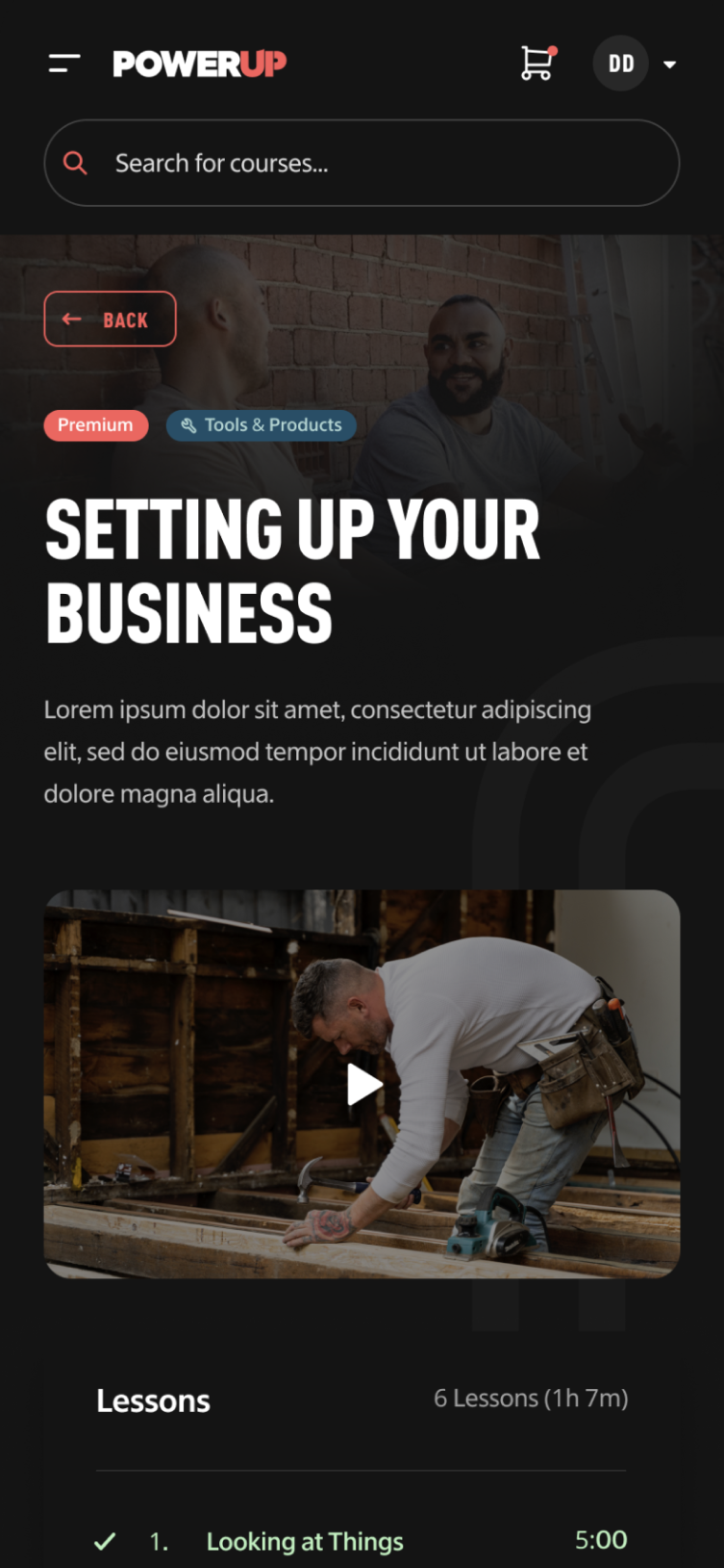
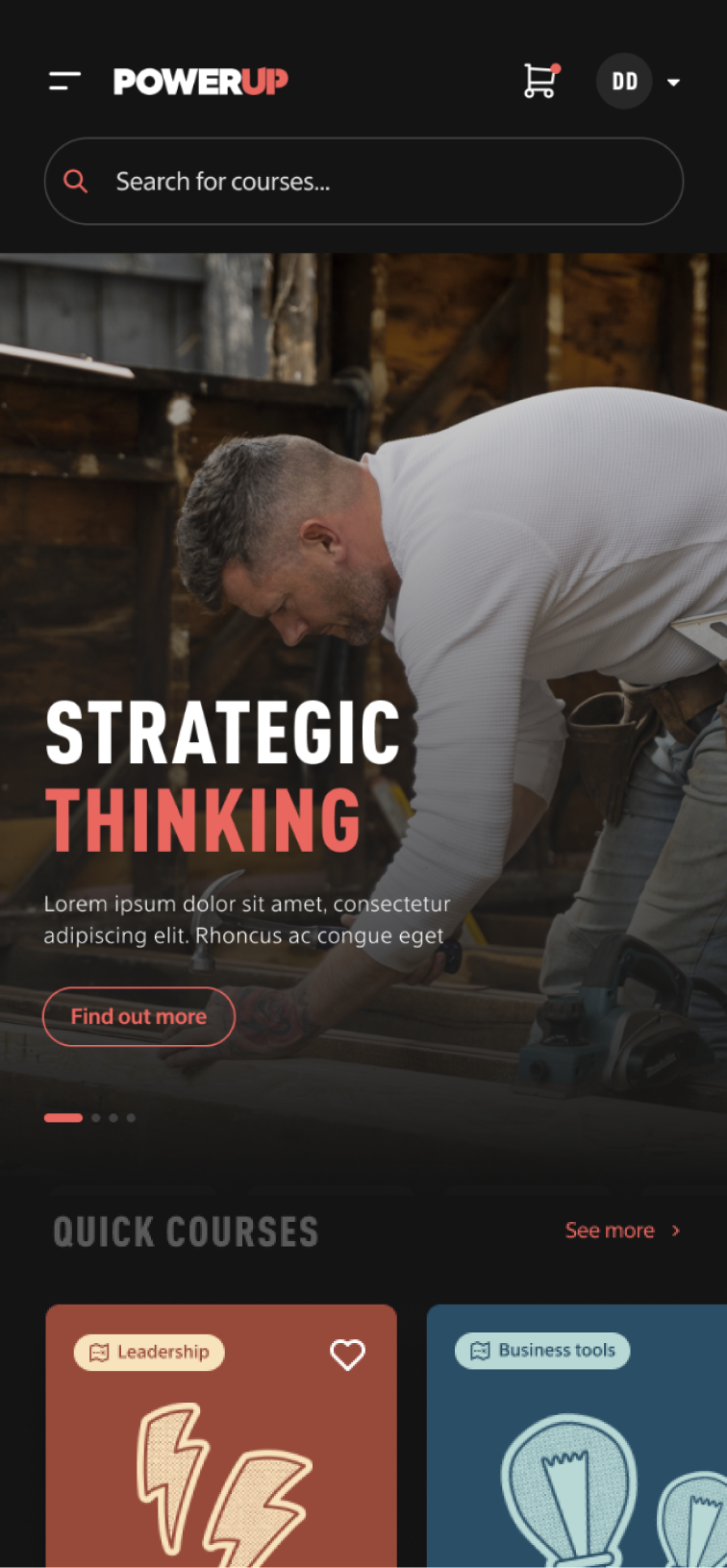
Working closely with the PowerUp education and content team we designed out the prototype for their online learning solution. We defined key user flows through the site, from first time visitors through to repeat learners. We blended brand-led messaging and design with simple and intuitive UX to create a digital learning experience that was easy, frictionless and personalised for each user.
