Pep Pep Pep
Pep Pep Pep
Pep Pep Pep

Inner Health
Pep by Inner Health
Client
Metagenics
What
- Naming + brand identity design
- Brand strategy
- Creative direction
- Illustration
- Experience design + development
- Copywriting
- UX design + UI design
- Motion
- Landing page design + development
- Animated social ads
Inner Health has been helping Aussies treat a wide range of gut-related conditions for more than 30 years. But most consumers still see probiotics as a quick fix, not a long term health strategy - which is why usage often drops off once the initial condition starts to improve. Our challenge was to educate Aussie women on the whole body benefits of long-term probiotic use, and find a way to make taking her Inner Health capsule as much a part of her daily routine as brushing her teeth.
01.
The Solution
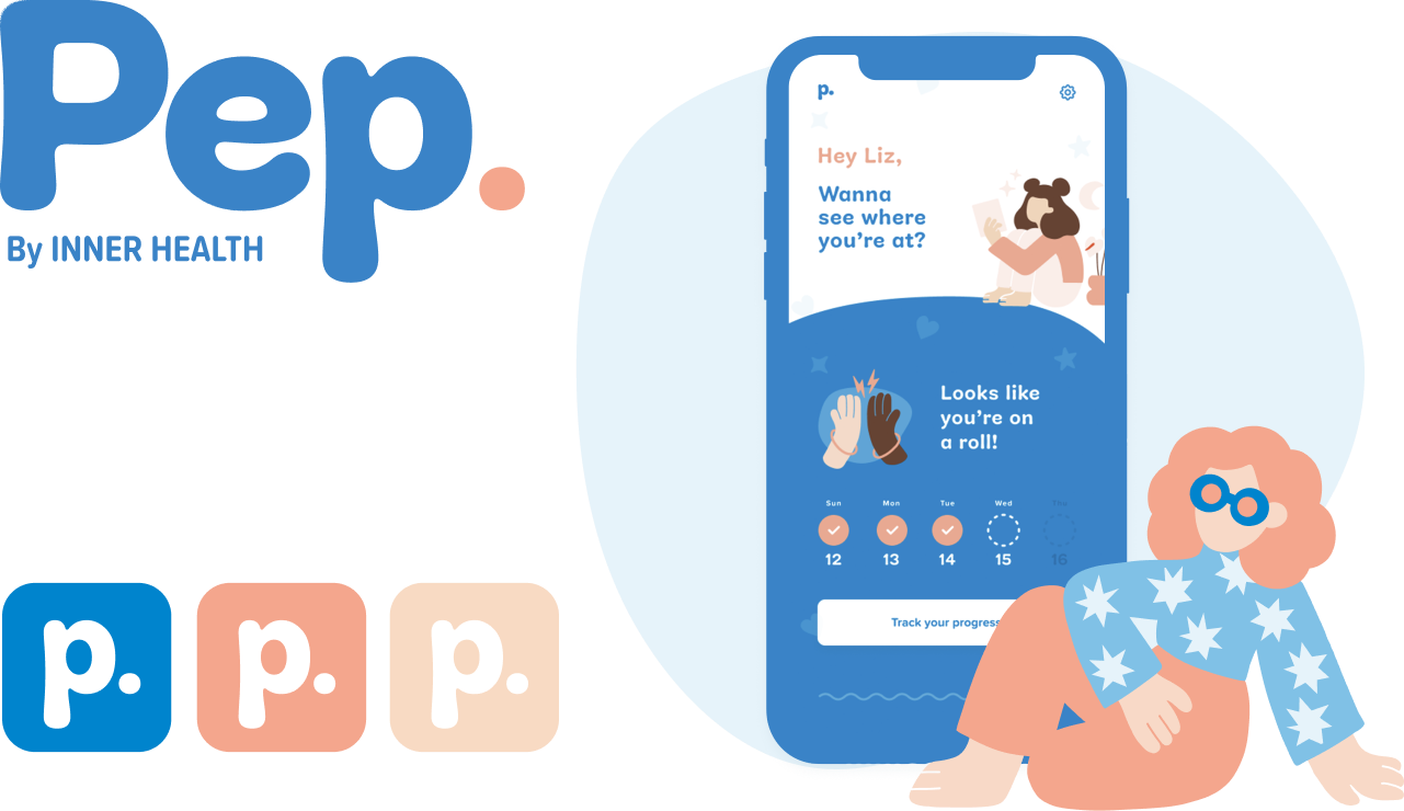
We created Pep, a free mobile web app and digital-first brand that combines daily SMS reminders to take your probiotic with gut-related health tips, a wellness tracker and simple mindfulness exercises to improve your whole body health.
02.
The brand idea

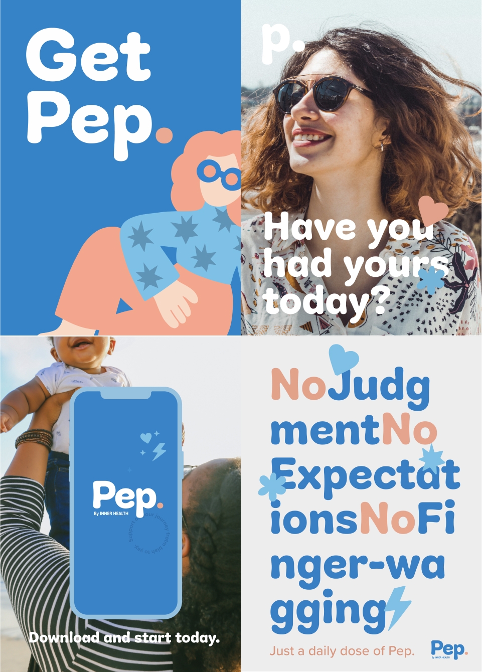
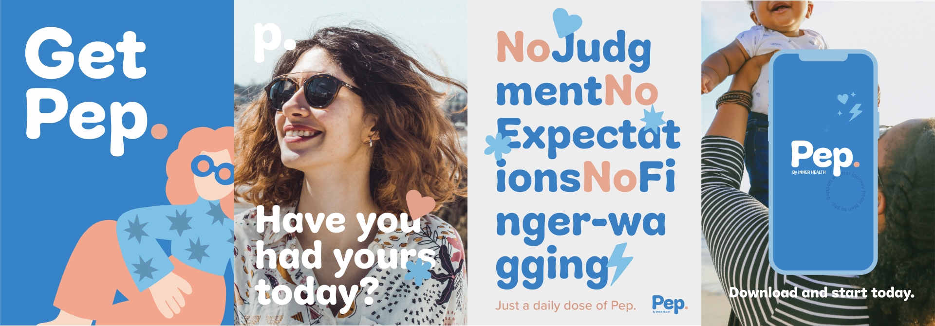
Before diving headlong into experience design, we mapped out a strategy for the Pep brand that would help it hit the mark. Our customer is over-burdened and under-supported - so we knew we had to get our message across in a way that felt fun and empowering and add value without adding extra hassle. Using our brand idea, Wingwoman, as our foundation, we formed a clear framework for how the Pep brand would think, talk and behave.
03.
Brand identity + illustration
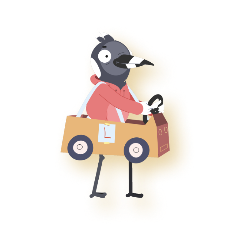
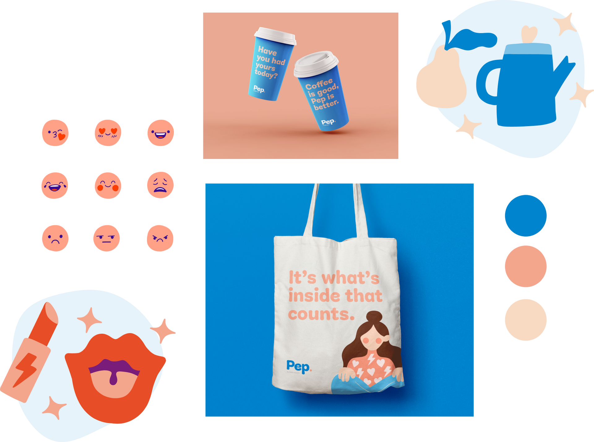
As a brand that would live almost entirely online, the Pep identity had to be clean, simple, and designed with motion in mind. A fresh, warm colour palette was coupled with organic forms and a quirky, lo-fi illustration style to make our brand down-to-earth, engaging and approachable.


Brand identity - Experience design
UX & UI - Copy
04.
UX Design
Next, we used design sprints to identify the principles and direction of the experience - and brought the client along for the ride. We landed on snackable, entertaining content, playful interactions and reminders, and a warm, witty tone of voice as Pep’s core pillars. The next steps involved sketching out concepts and user journeys, then creating a design system which tapped into the audience’s established digital patterns and behaviours.
05.
UI Design
Armed with our brand framework and experience principles, we moved into UI design and developed an interactive prototype for end user testing. In line with our strategy to keep content engaging and playful, we incorporated motion into our designs to add some extra oomph.


06.
Technology
We built Pep as a progressive web application to bypass app store barriers and increase uptake, and used a decoupled architecture leveraging AWS infrastructure alongside services like SendGrid and Twilio. We also created a custom-built reporting dashboard to enable real time analysis of users’ engagement and progress within the experience.
07.
Optimisation
Great design is a continuous process: we don’t just down tools once an experience goes live. To keep improving the user experience post-launch, we implemented Hotjar & Analytical tools to observe real time user journeys, then applied UX & UI improvements based on our findings. We’ve also developed a backlog of feature recommendations for the next experience release.


It’s no coincidence that I’ve sought this incredible team out time and time again over my career. They’ve assembled a killer team that punch well above their weight. I actively recommend them, but also hope they’ll always be available to take on my briefs.
Project awards.
BADC Awards
Bronze
Apps
2021
BADC Awards
Finalist
Brand Identity Suite
2021
