Move With Us
Move With Us
Move With Us

Move With Us
Move With Us
Client
Move With Us
What
- Brand identity design
- Art direction
- Copywriting
- Photography
- Illustration
- Motion
- Brand guidelines
- Digital rollout
Fitness apps are fast replacing PTs and in-person classes as more consumers choose to get their fitness fix online. With a potential global audience up for grabs, the opportunity for growth is huge - which is why Bodies By Rachel decided their cult fitness app was ripe for a rebrand. Our brief was to develop a brand framework and identity suite that would inspire more fitness-loving females to join the community - without alienating Rachel’s fanbase of die-hard followers.
01.
The strategy
With the market saturated with lookalike apps offering variations on the same superficial theme, we spied an opportunity for a genuinely purpose-driven fitness brand: one that did more than pay lip-service to the themes of empowerment and body-positivity. Move With Us was a brand on a mission: to empower and transform women’s hearts, minds and bodies through fitness. So we took that mission and shone a big old spotlight on it, reframing a women’s workout app as a life-changing fitness movement and global sisterhood.
02.
The approach
One thing was clear from the outset: to move forward and compete on a global scale, we needed to decouple the app’s brand from that of its founder. With a new name - Move With Us - already landed on, we set about unearthing the truths and insights that would inform the brand’s evolution and help it stand on its own two feet. Through a mix of user interviews, stakeholder workshops and category research, we developed the strategic framework that would define the way Move With Us looks, talks and behaves.
03.
The brand idea

Move With Us is a brand defined by action and who use fitness as a catalyst to change and improve people’s lives. They’re constantly moving forward and challenging themselves - and inspire their community to do the same. So we coined a new term - “active-ism” - to help us articulate these overlapping themes. When we call Move With Us ‘The Active-ists’, we’re redefining activism within the context of fitness, drawing attention to the brand’s energy, vitality and greater purpose as well as its community of passionate advocates.
04.
Brandmark
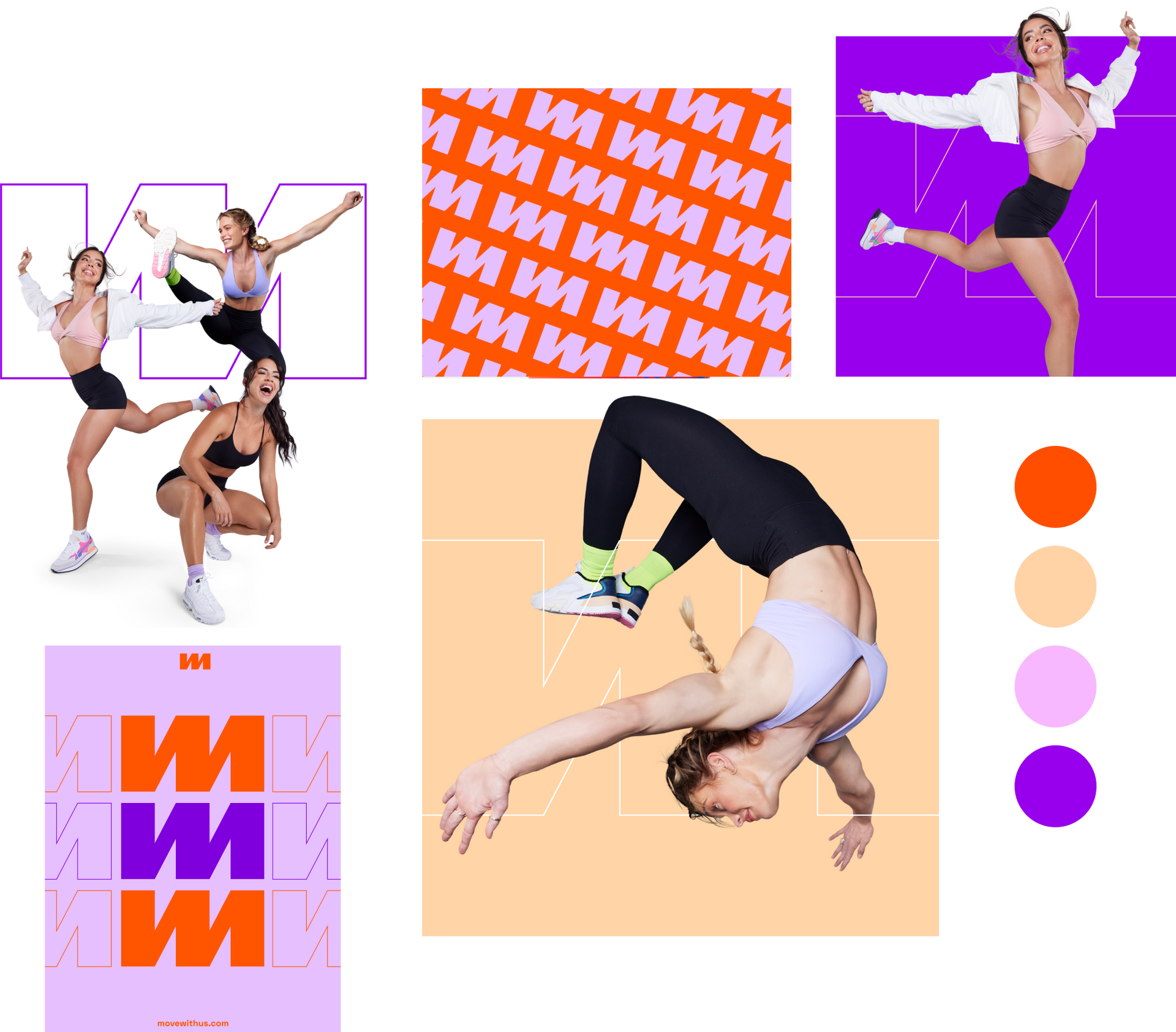
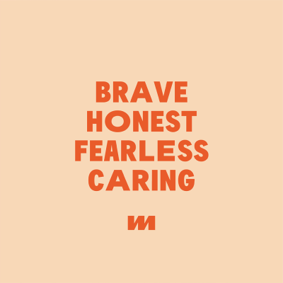
As a brand which lives almost entirely online, the Move With Us brandmark had to be both flexible and responsive. By combining the letter forms M, W and U, we created a versatile symbol that can be used in isolation in smaller digital environments or alongside the full wordmark in larger use cases, doubling as an abstract graphical element as well as a repeating pattern. To compliment the sense of movement and energy in the symbol, we used a combination of different font weights and italics, selecting heavier fonts to improve readability and make the mark mobile-friendly.




Brand strategy - Identity
Copy - Photography - Motion
05.
Digital
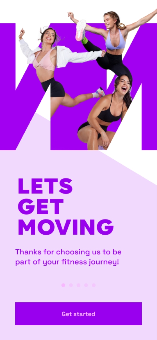
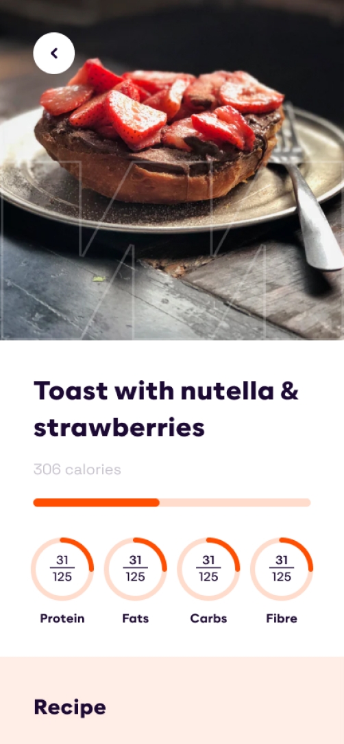
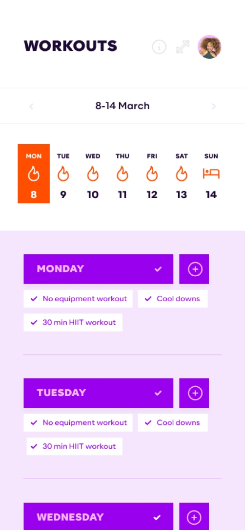
To demonstrate how the Move With Us brand would come to life online, we reskinned the existing website and mobile app to align with our Active-ism strategy, applying new photography, visual language and tone of voice.

06.
Photography
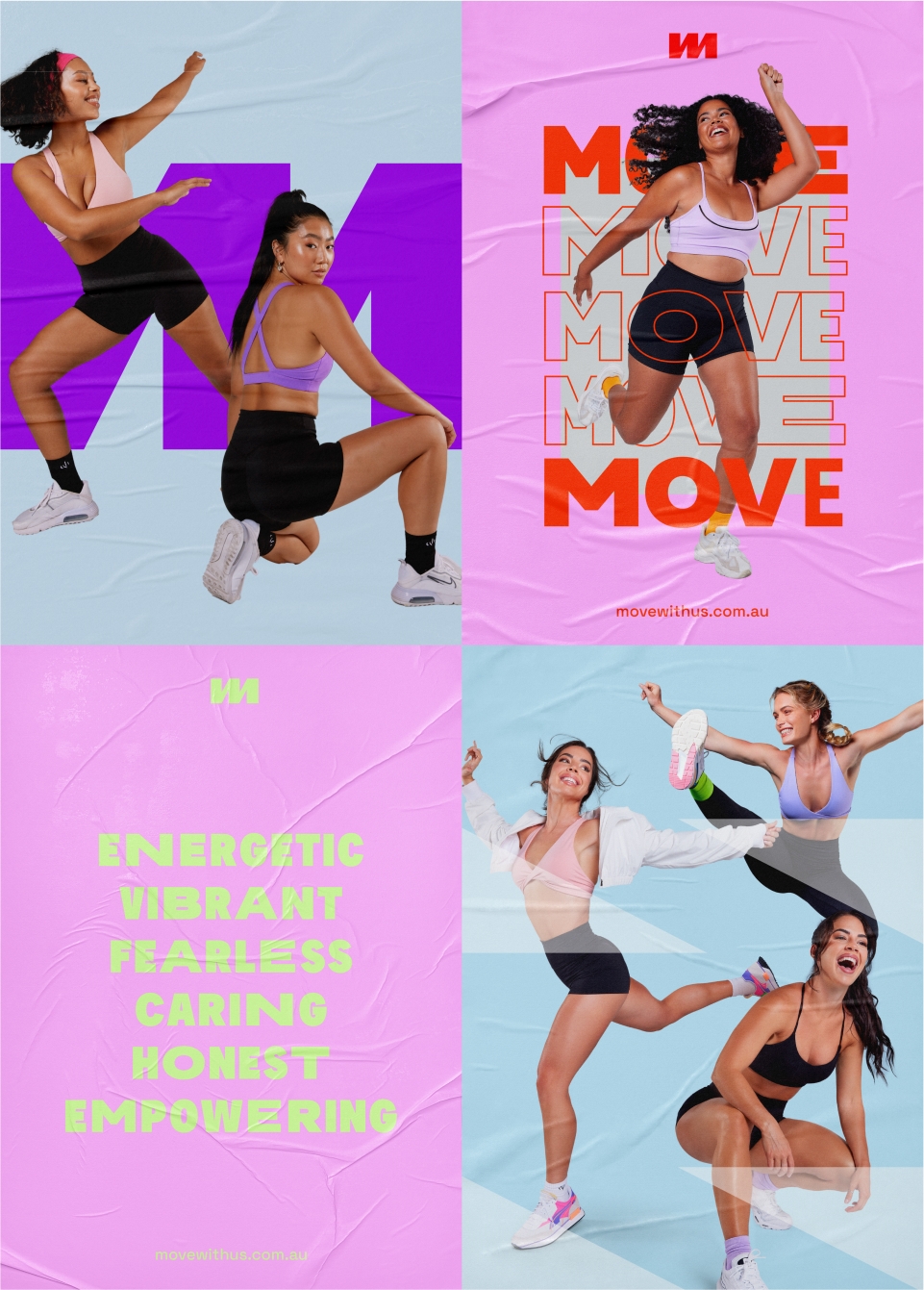
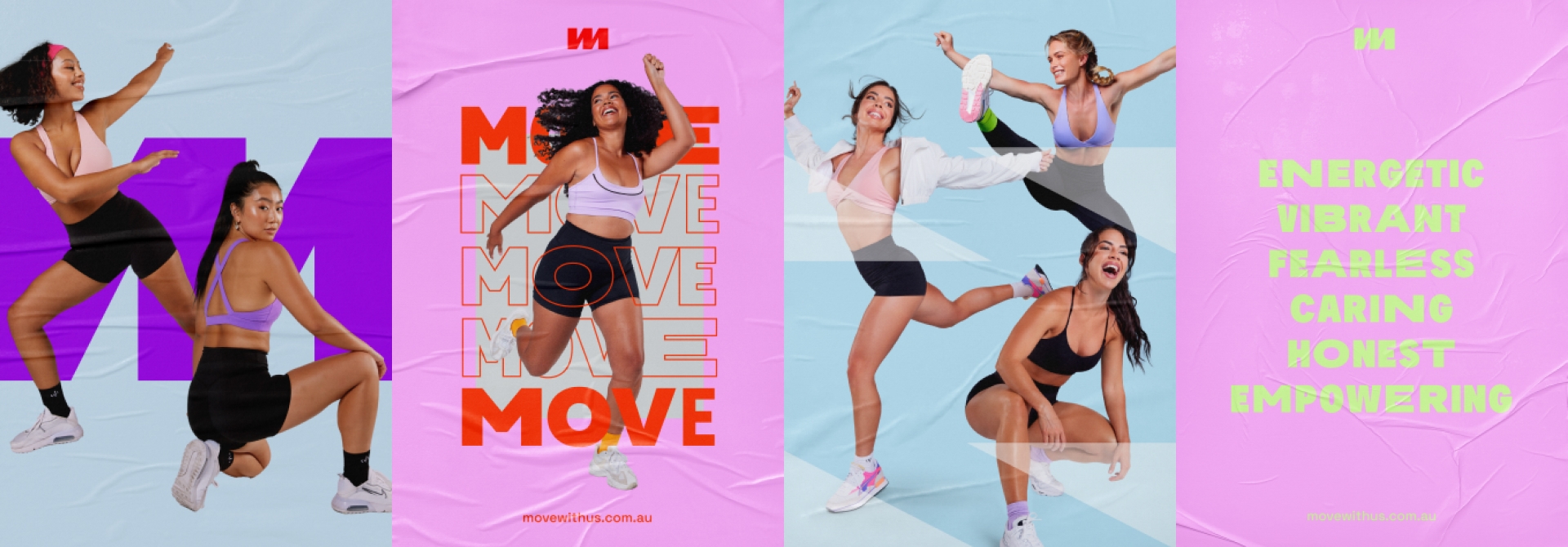
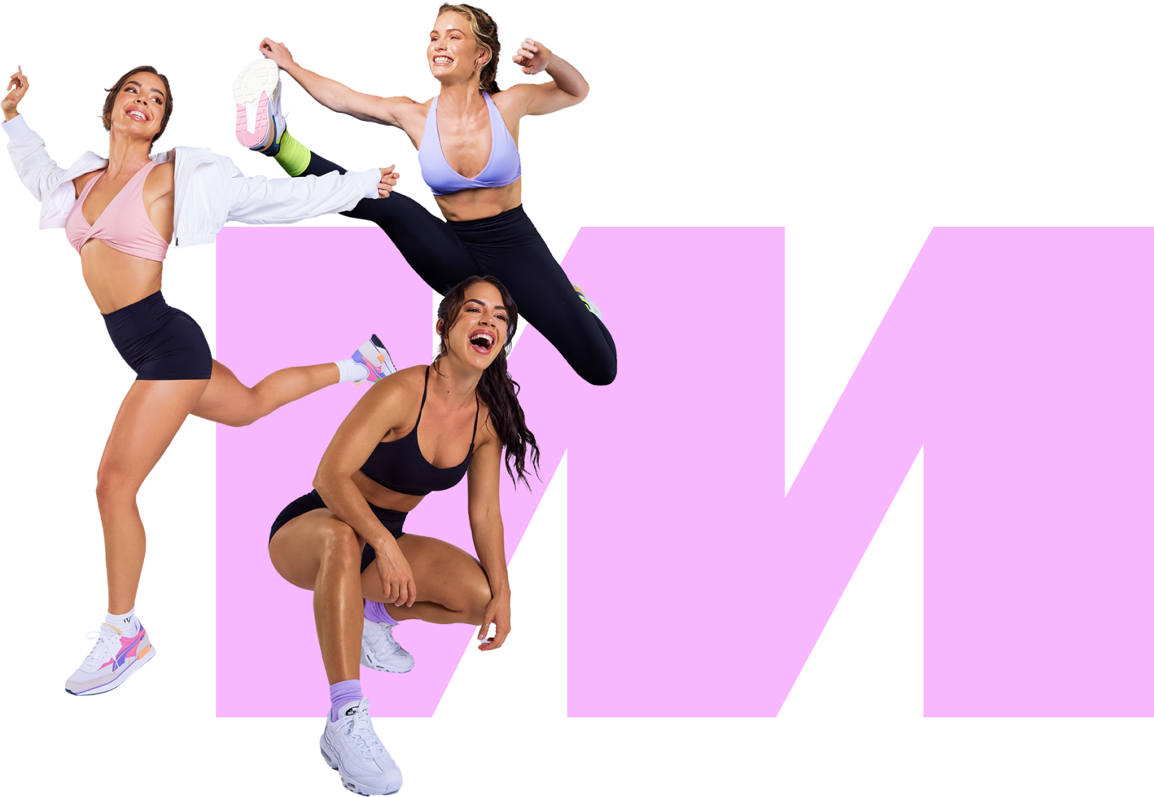
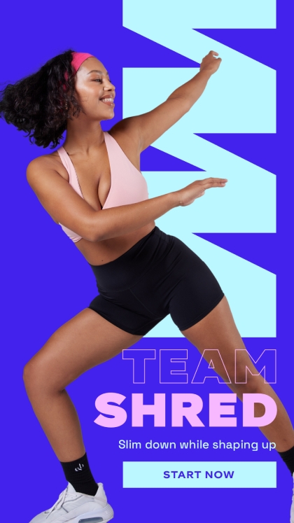
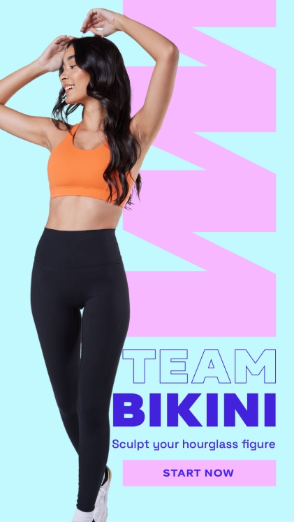
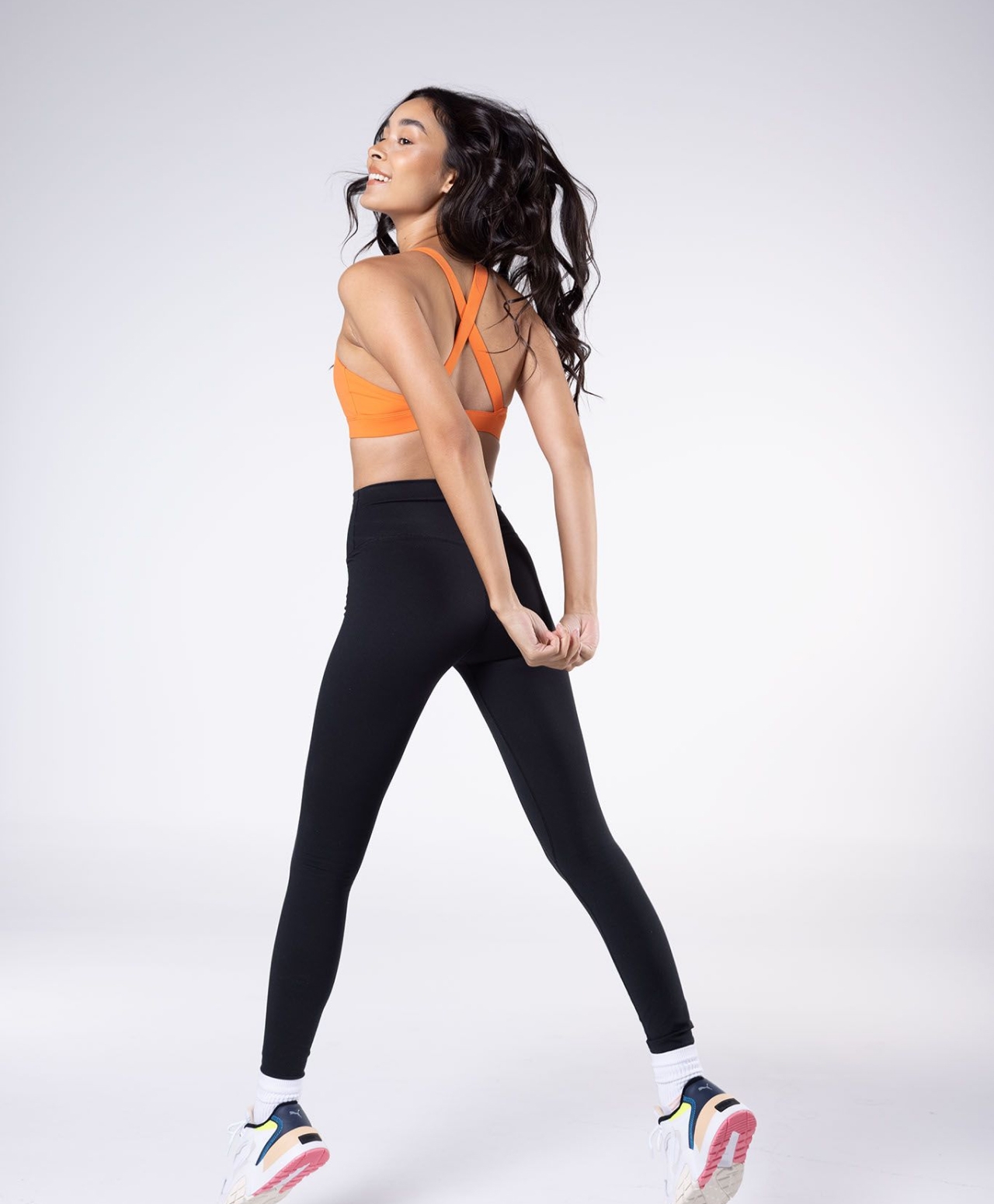
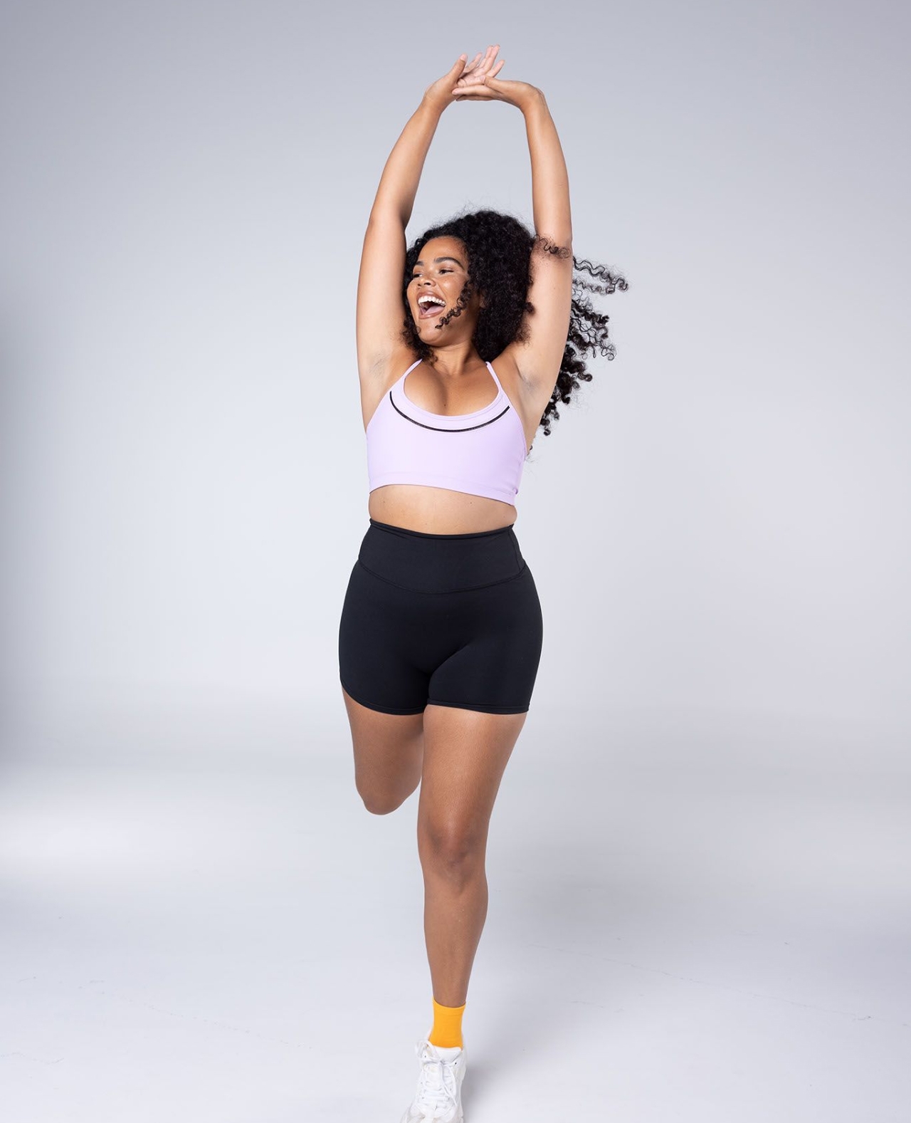
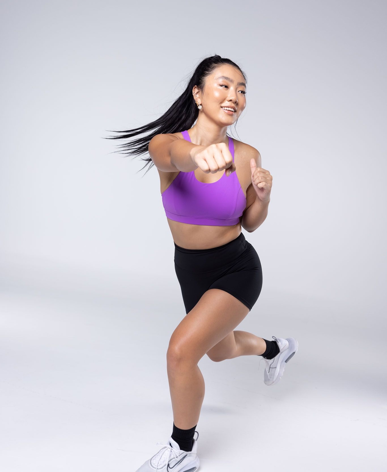
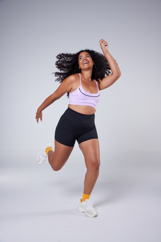
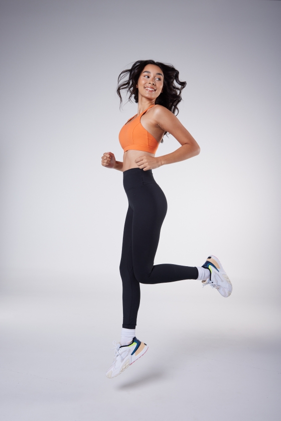
In a category awash with imagery of serious-faced gym babes working out in flawless hair and makeup without breaking a sweat, Move With Us needed a photography style that showed they stood for something altogether different. So we swapped static beauty shots for playful, dynamic images of women in motion, dialling down the polish in favour of a more natural aesthetic.
Brand strategy - Identity
Copy - Photography - Motion
The rebrand has been extremely well-received by our community and we couldn't have asked for things to have gone much better. Type + Pixel did a great job of accommodating our timelines and delivered on everything they promised. We couldn't have done it without them!


