MISO HUNGRY
MISO HUNGRY
MISO HUNGRY

Brand + Strategy
MISO HUNGRY
Client
MISO HUNGRY
What
- Brand strategy
- Brand Identity Design
- Naming
- Illustration
- Brand Guidelines
- Copywriting
- Development + hosting
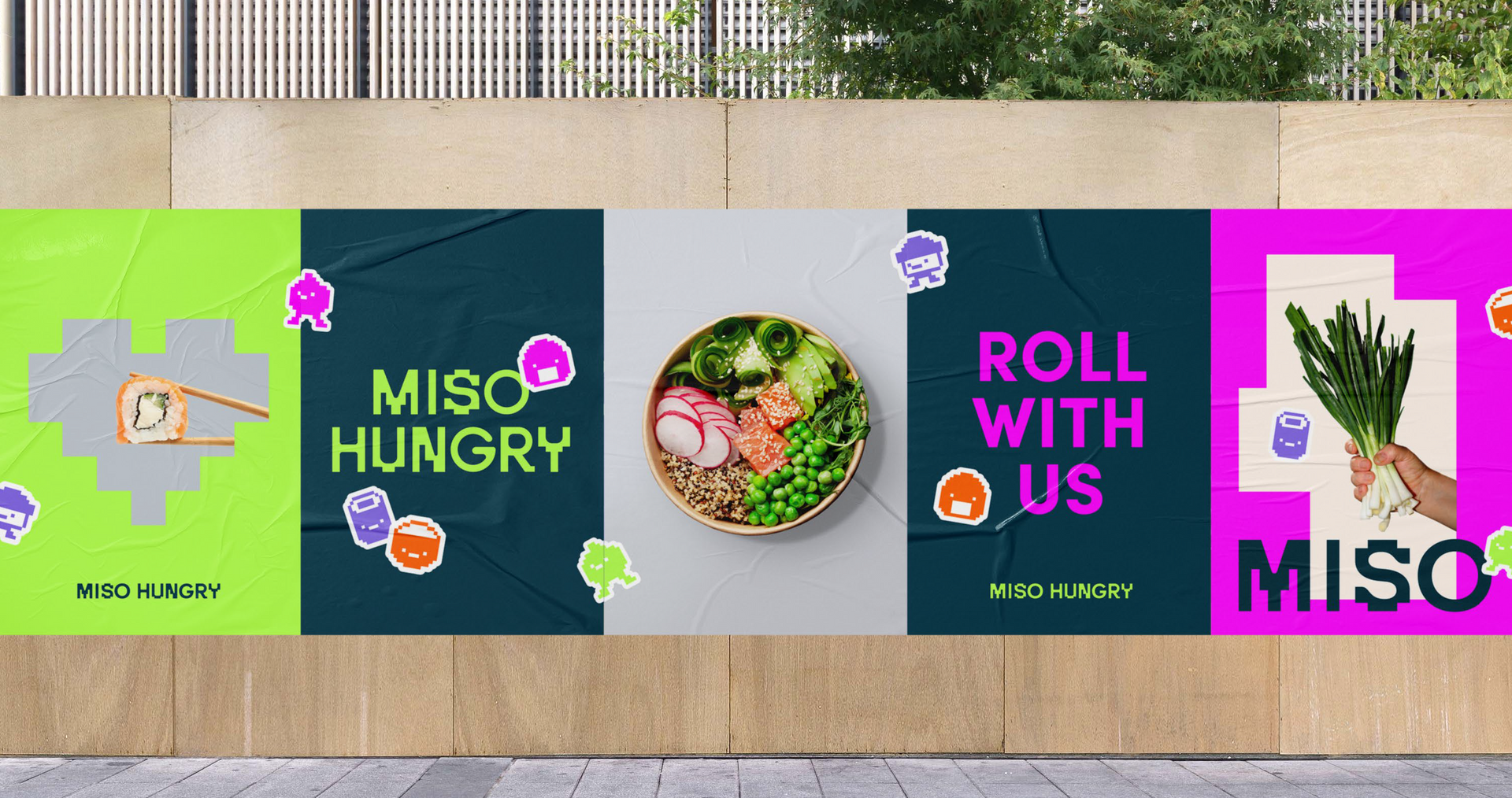
Australia is saturated with sushi options, so when three Brisbane sushi fans decided to turn their love of Japanese street food into a business, they needed our help getting cut through.
01.
The challenge
Create a retail sushi brand that would catch the attention of young Aussie consumers and provide the platform for franchise expansion.
02.
The strategy
When it comes to Japanese cuisine, there are plenty of cultural tropes for brands to fall back on. From boujee fine dining to cheap and cheerful sushi trains, everyone’s talking about tradition, heritage and authenticity. Our brand could claim none of those things (they’re not even from Japan). So instead of trying to hide it, we celebrated it - with a tongue-in-cheek origin story, a playful name and a colourful, cheeky brand to match.
03.
The brand direction
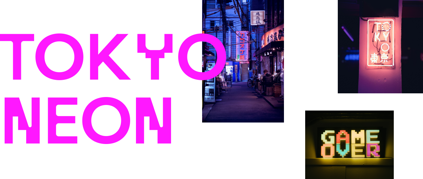
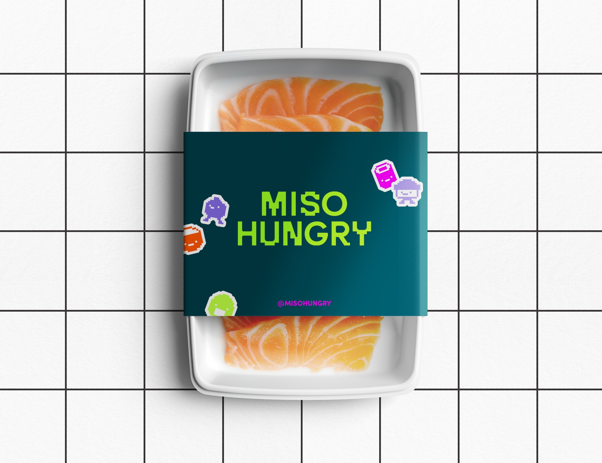
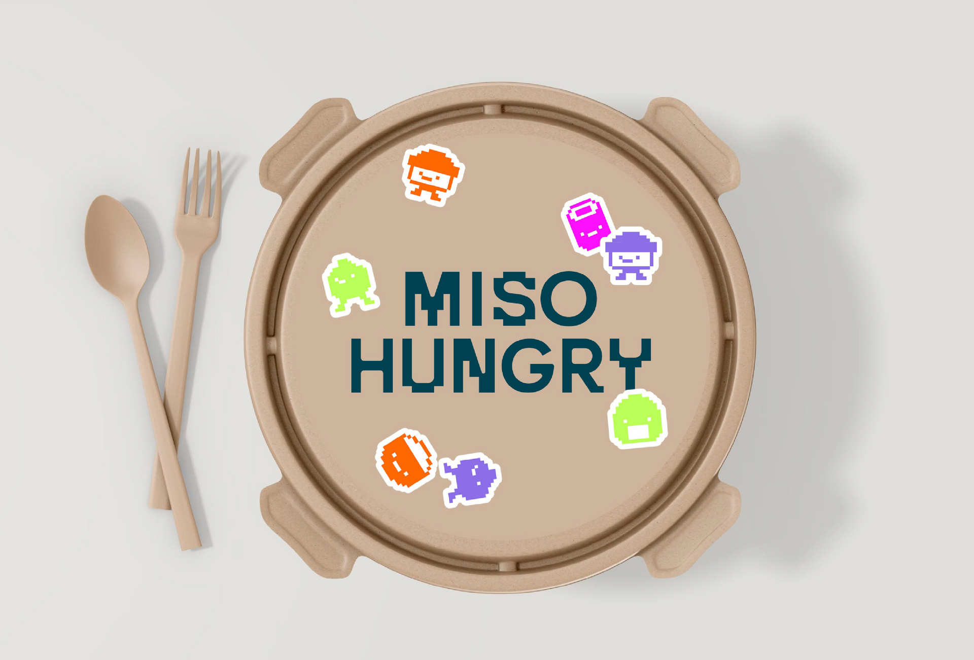
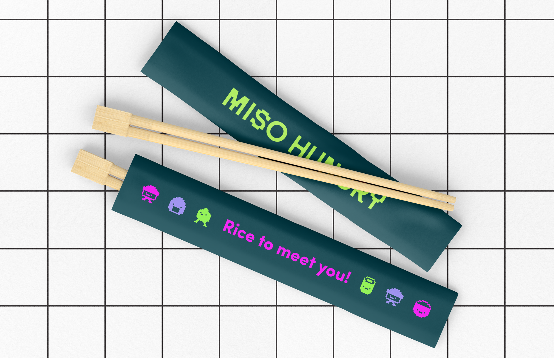
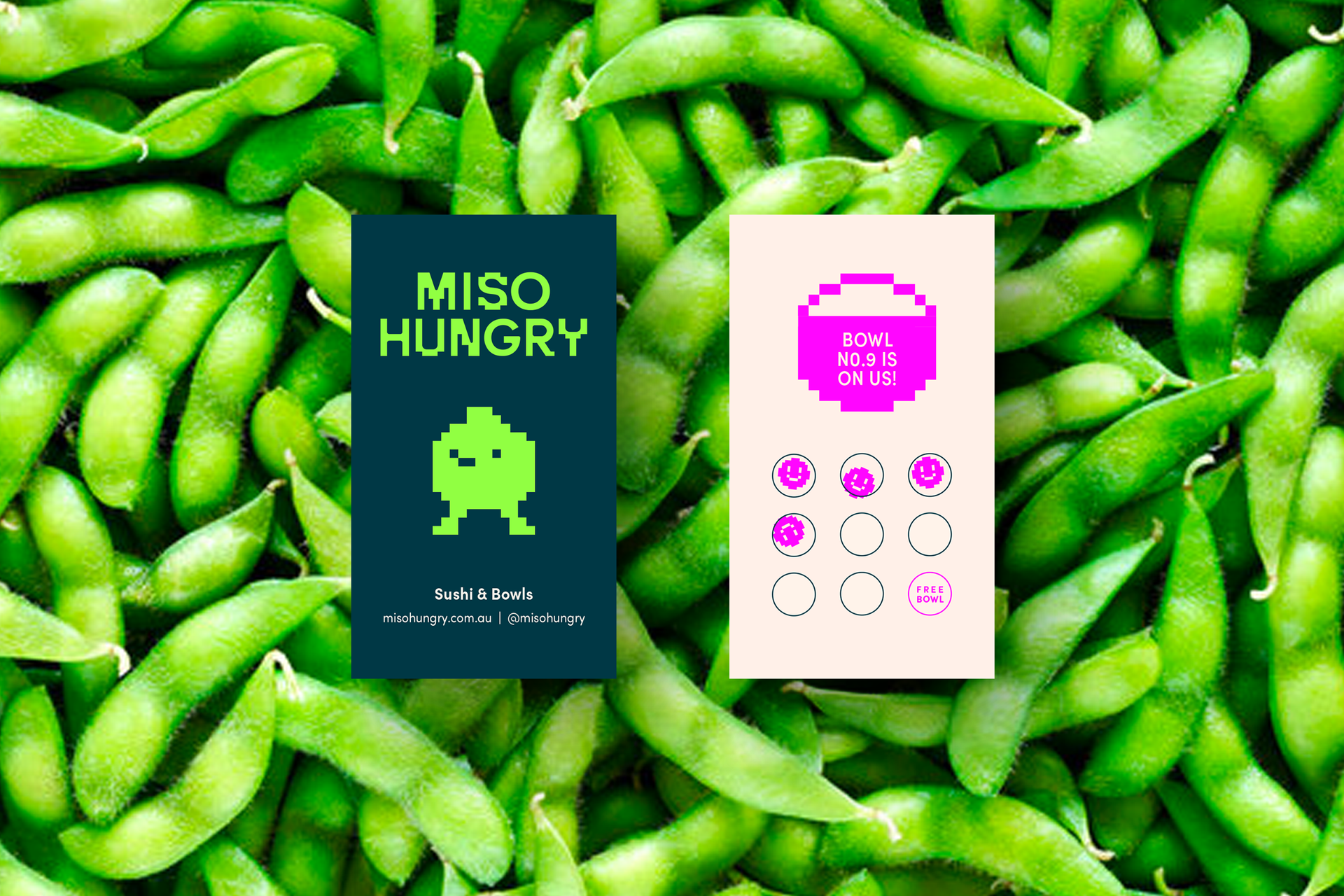
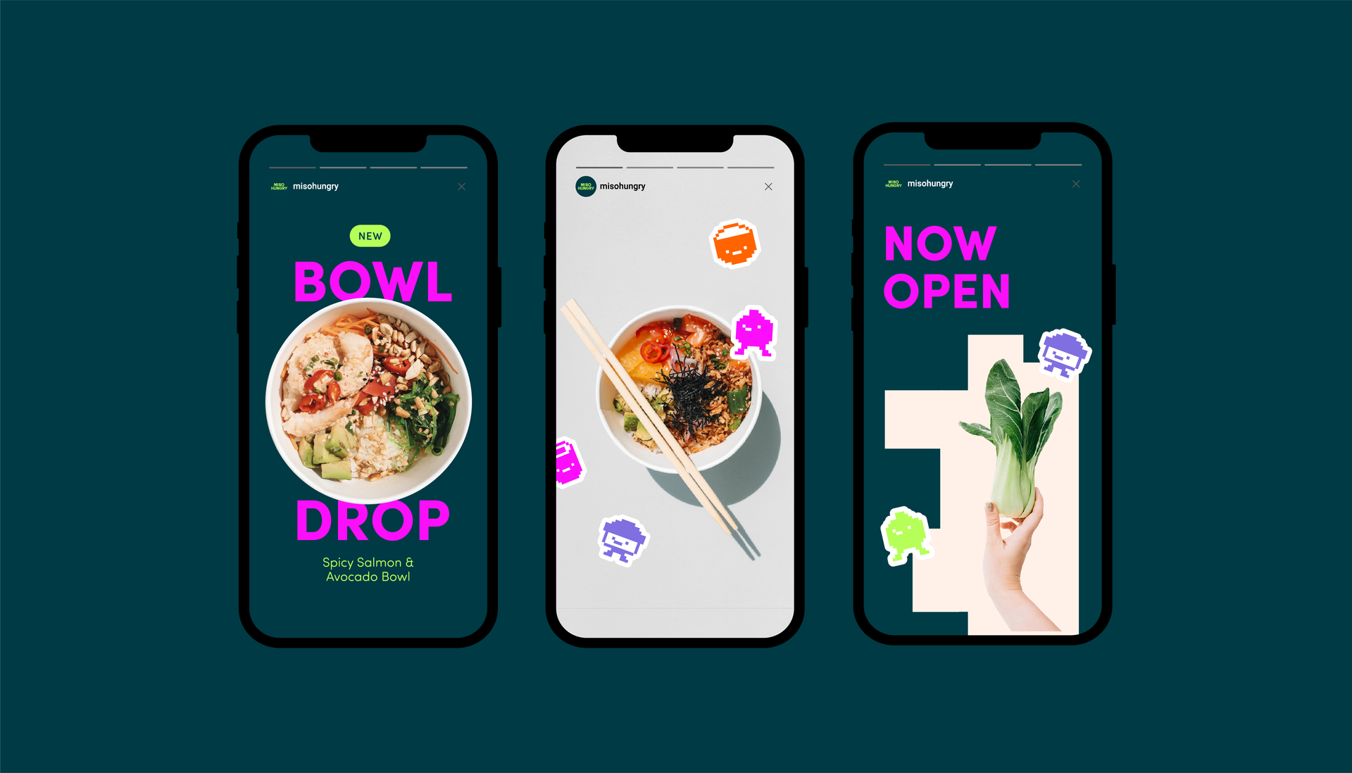
Neon brights, retro game characters and pixellated elements all come together to create a style we've coined 'tokyo arcade'.
04.
Brand Expression
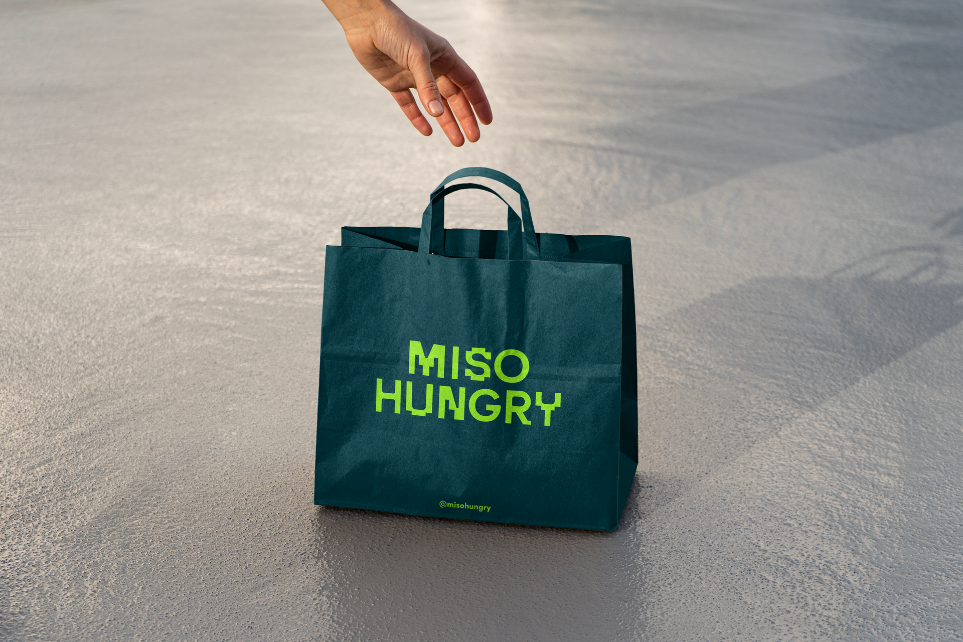
We needed a bold, highly recognisable brand suite that could be applied across multiple executions, from store signage and menus to digital environments. The result was a concept we coined “Tokyo Arcade”: a mix of retro game-style characters and graphical elements, mixed with neon brights. The variety of characters and pixellated illustration style is designed to work across point-of-sale and physical executions as well as digital environments where motion and movement can be incorporated.

Brand workshops + strategy
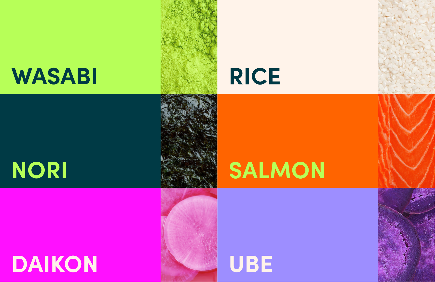
Brand + creative identity suite
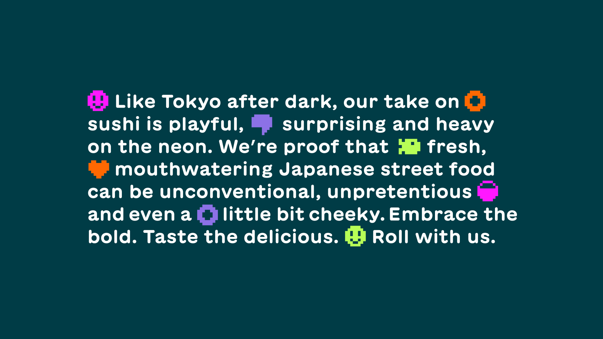
Brand manifesto + copywriting
Interior + exterior restaurant signage
