Alpha Digital
Alpha Digital
Alpha Digital

Brand + Strategy
Alpha Digital
Client
Alpha Digital
What
- Brand workshops + strategy
- Brand + creative identity suite
- Brand guidelines
- Client + employee handbooks
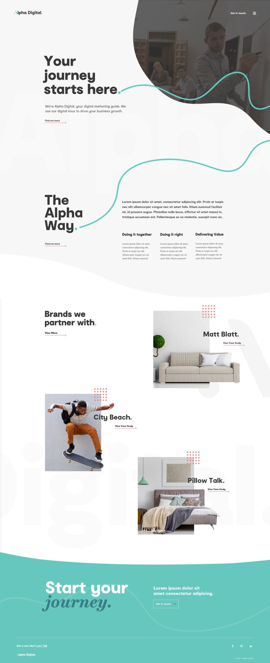
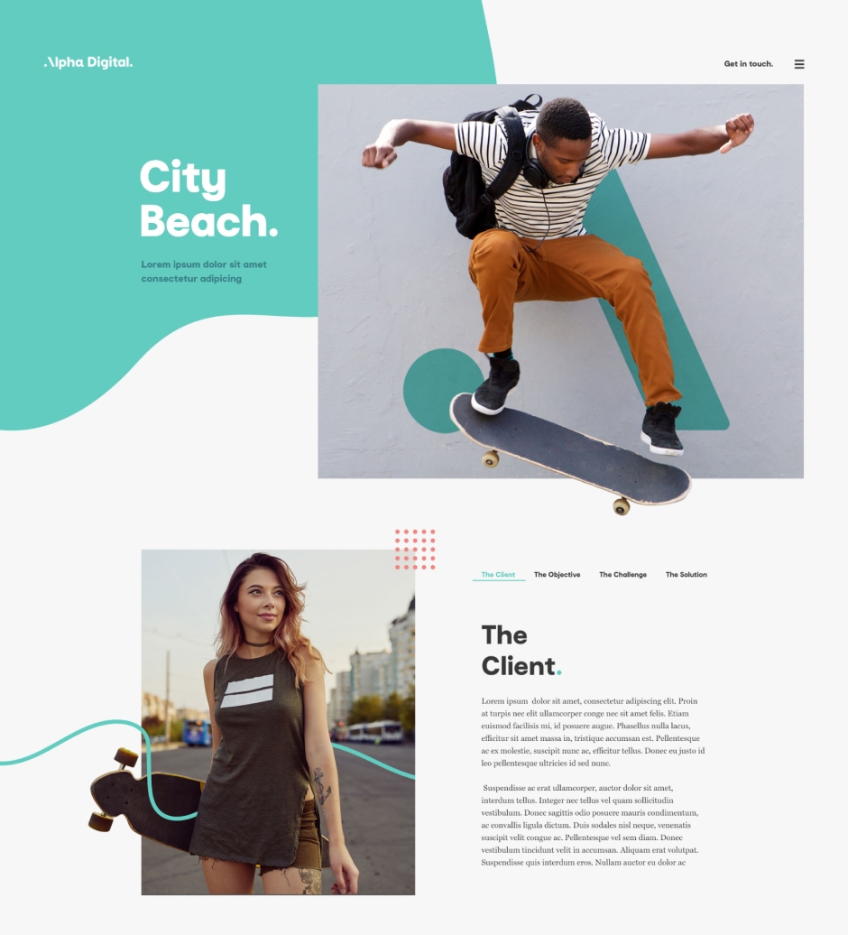
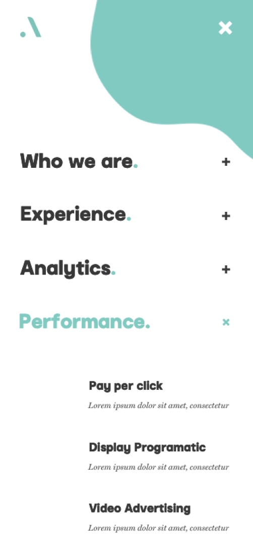
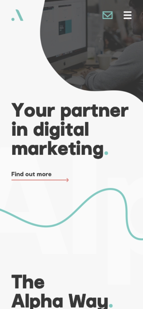
- Website design + development
- UI / UX
- Art direction + photography
- Copywriting
The digital marketing industry suffers from an image problem. It’s not easily understood by those outside the space. The landscape is constantly changing. And there are more than a few cowboys out there playing fast and loose with their clients’ budgets. Which is why, when Alpha Digital asked us to help reposition their brand and find their point of difference, we knew that trust would play a central role in our approach.
01.
The approach
To help Alpha identify a clear position for themselves, we first took them on a rigorous discovery process. A landscape and competitor audit helped us to pinpoint the white space that Alpha could occupy. Then, through a series of intensive stakeholder workshops, we uncovered the agency’s brand traits and truths, mapping them against their clients’ needs and wants to see where they overlapped.
02.
The strategy
It quickly became clear that clients valued three things above all else: partnership, integrity and expertise. And while plenty of Alpha’s competitors talked up their technical skills, on the topics of trust and collaboration they were surprisingly silent. Fortunately for Alpha, they could deliver on all three counts. Our challenge was to find a way to articulate these qualities in a single, compelling brand idea.
03.
The brand idea

Like the famous Himalayan mountain guides, Alpha are equal parts humble and knowledgeable. Their job is to lead clients on a journey through an unfamiliar, challenging landscape. They share their intimate knowledge of the terrain and use it to empower others to achieve greatness. And they understand that mutual trust and partnership is essential to surviving the journey. This idea of Alpha as the sherpas of the digital marketing industry became the lynchpin of our brand strategy, informing our visual and verbal identity and shaping the brand’s personality and behaviours.
04.
Brandmark
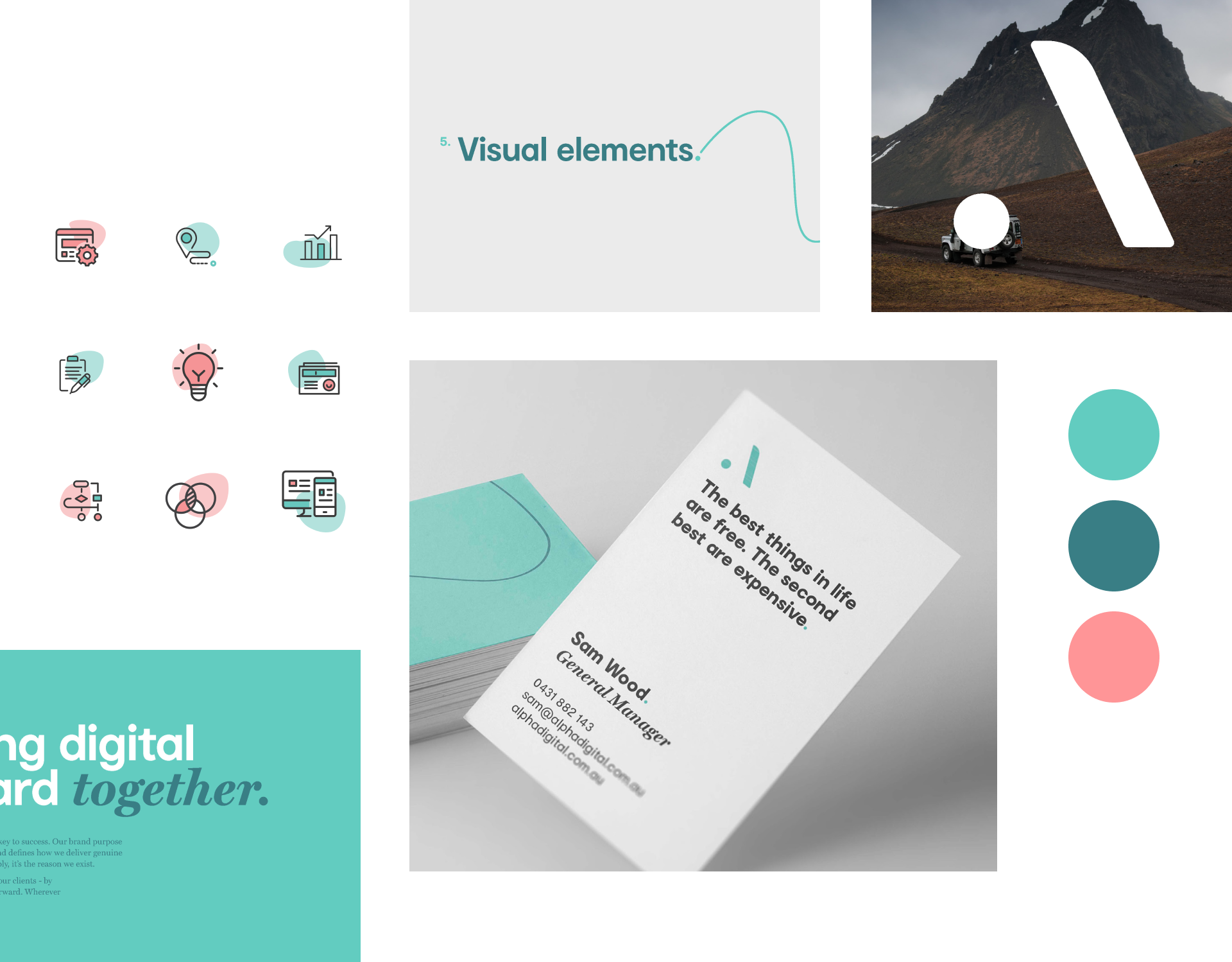
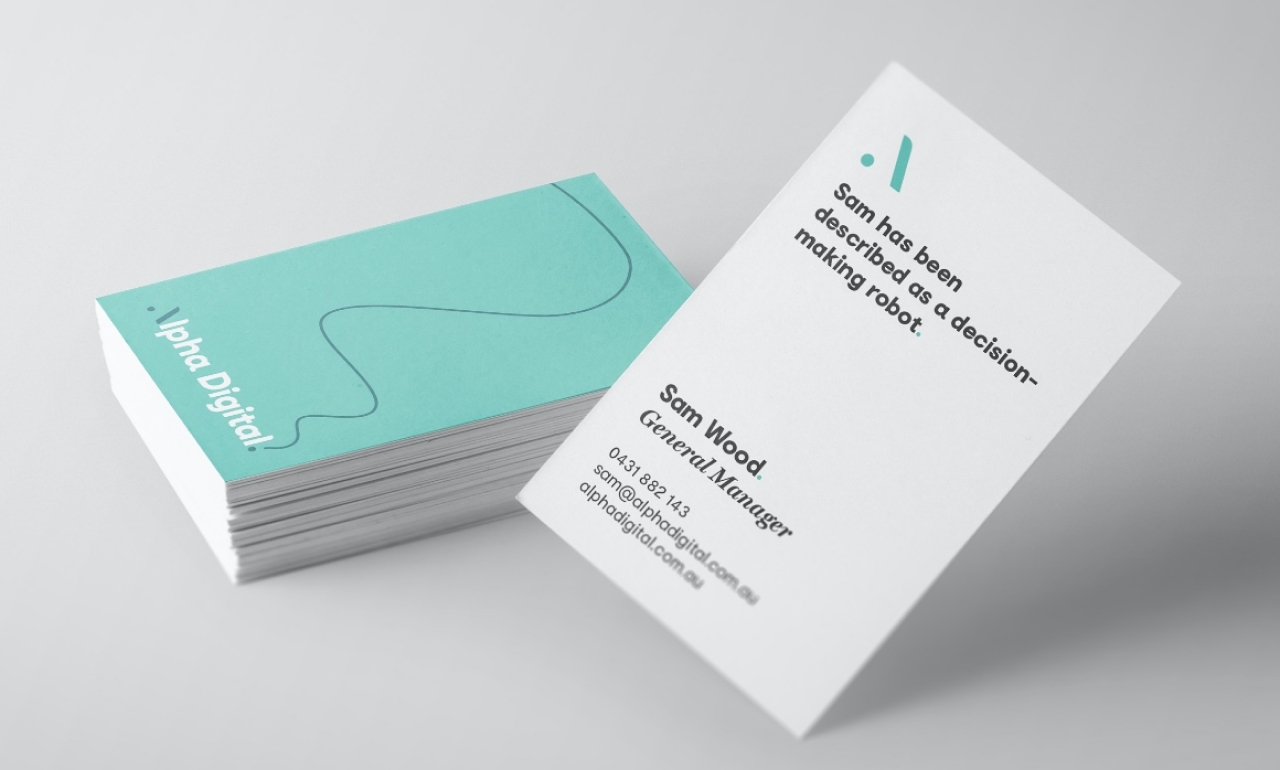
We developed a logo that would act as the visual representation of the sherpa’s journey. A stylised ‘A’, comprised of an opening dot and an ascending slope, represents the journey’s starting point and the challenge to conquer. The full stop at the end of the word represents the journey’s successful end point.



Brand strategy - Identity
Website - Development
05.
Website
We created a mobile-optimised microsite to showcase the range, featuring a creature character quiz to increase engagement and encourage users to immerse themselves in the story. Not only did the site receive 30,000 visits in six weeks, but 50% of visitors took the quiz to discover their inner creature.
I am thrilled with the outcome of Type + Pixel's work.The feedback from our clients, employees, and partners has been nothing but positive!


